

Overview 📝
As LexisNexis Risk Solutions transitioned to a modern content management system, standardized page templates were needed to ensure consistency and support SEO/GEO content strategies. As Lead UX designer, I conducted research, collaborated with multiple teams, created lo-fi / hi-fi wireframes, and documented template guidance and best practices. Details 🖇
🗓 Timeframe: June - November 2026 🧑🏽💻 Role: Lead UX Designer, Lead Strategist👥 Teams: Digital Marketing Web Ops, Brand, SEO🧰 Tools: Figma, Figjam, Sitecore, Smartsheets, Wingify, Microsoft CopilotTHE OPPORTUNITY
Modernizing page templates in a way that is consistent with UX and SEO/GEO best practices, while utilizing new components and CMS capabilities.
PHASE 01 - REQUIREMENTS GATHERING [JUNE-AUGUST]
Before we make the new site cool and shiny, let’s realign on page goals and gaps.
In current state there are 3 categories of page types: Product, Solutions/Capabilities, and Insights and Resources (I&R). In the first phase. ofthe project, I met with lead digital segment marketers to document content needs and understand which stage of the marketing funnel these pages appear, and Call to Actions. During this phase I also want to ensure edge cases, pitfalls, and previous user testing is accounted for in my analysis.
Requirements were documented in an excel sheet and user goal per page was documented in a word docuement, both shared out with marketers once finalized to ensure alignment.


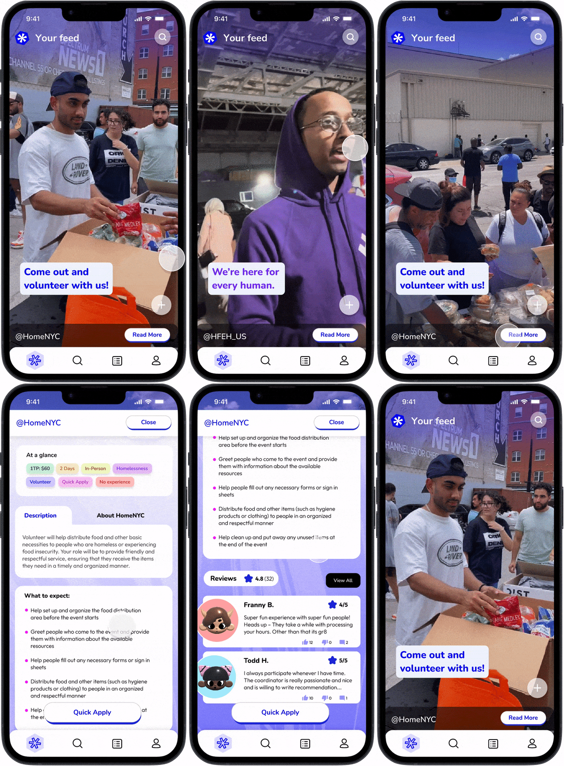


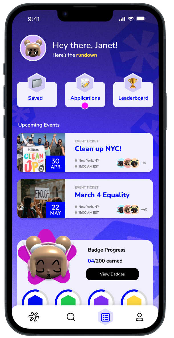

Discover
🔎
Discover 🔎
INTERVIEW INSIGHTS
Other platforms do not tailor to the preferences of Gen Z
Interviewees had limited knowledge of volunteer platforms on mobile. Mentioned: Deed & TurnUP


USER RESEARCH

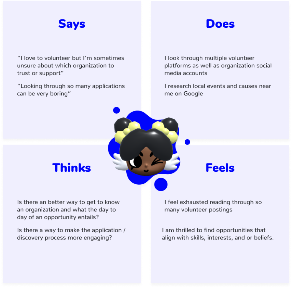
Stemming from insights found through interviewing, a persona and empathy map is created to highlight common goals & frustrations. Persona & Empathy Map

DEFINING THE PROBLEM
How might we create an engaging digital platform for young adults to seek opportunities & learn about social causes?
Ideate
💡
Ideate 💡
POTENTIAL DESIGNS
Determining steps within potential pages & where features would be placedMain User Flow

POTENTIAL DESIGNS

LOFI & HIFI wireframes were created based on user flow. After feedback sessions a second draft was made. Wireframe Process
Design
🎨
Design 🎨
DELIVERABLES
Final Frames
Final frames designed & prototyped within Figma. Logo designed in Adobe Illustrator.
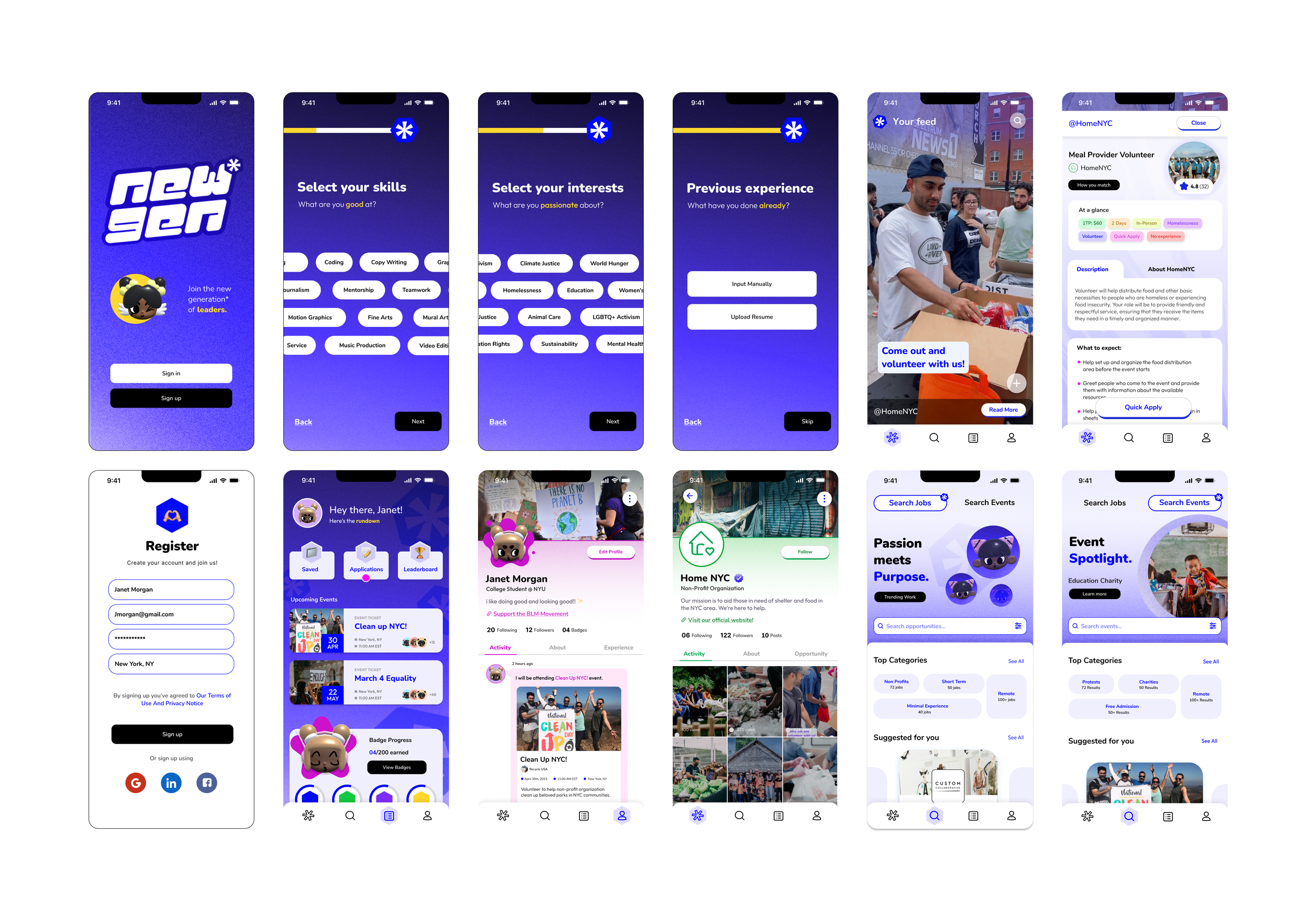
LOOK & FEEL
Youthful, Engaging, & Fun

I wanted this design to resonate with young adults who are appreciative of boldness and personality in design. Based on trending aesthetics, I made sure to stray away from a "corporate" and bland design.Reflect
📌
Reflect 📌
WHAT I’VE LEARNED
This was a very ambitious project to work on. One thing I kept in mind while designing was making sure this was an app that didn’t feel too ‘corporate’ - an approach that is used in most volunteer platforms. I wanted to create a space that is fun and immersive. One thing I kept in mind was design accessibility standards as I had to go back and make sure the colors I was using were acceptable. In the future, I would love to continue to expand this idea to be even more relevant to technology and design. When looking into AI and AR, there are opportunities to take this project to the next level.
Thank you for viewing!